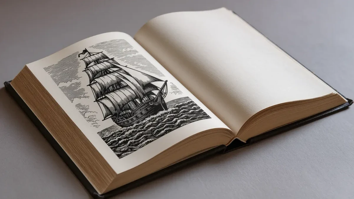
Illustrated classics are canonical texts re-seen by a major artist, and occasionally the pictures become as canonical as the prose. Rockwell Kent's 1930 Random House edition of Moby-Dick (1851) carried roughly 280 wood engravings and sold out during the Depression — proof that an illustrated classic could carry aesthetic and commercial weight at once.
What made Rockwell Kent's Moby-Dick extraordinary?
Commitment, cut into boxwood. For the 1930 Random House edition of Melville's Moby-Dick, Kent cut roughly 280 wood engravings — chapter heads, tailpieces, full-page plates — and the one-volume trade edition sold out during the Depression, confounding a market assumed to have no appetite for so long a whale.
The commission had a distinguished prehistory. Chicago's Lakeside Press issued a three-volume edition of 1,000 copies in 1930 for subscribers, and Random House built its one-volume trade edition on the same blocks. Kent's medium was wood engraving — end-grain boxwood, white line against black — and his Melville is all flat blacks and starry voids: whales as geometry, sailors as carved fate. Against retail logic, the trade edition sold out through the Depression, and Kent's imagery has accompanied Melville's text in later reprints ever since.
The deeper effect was critical. Kent's engravings argued for a monumental Melville — tragic, symbolic, stricken — at a moment when the novelist's reputation was still climbing back from decades of neglect. The pictures did not merely decorate a classic; they made a case about what kind of classic it was.
When did illustrated classics become an institution?
In the nineteenth century, with the wood-engraving boom. Gustave Doré's plates for Don Quixote (1863) fixed how the knight looks to readers who never opened Cervantes; deluxe illustrated editions of Milton, Dante and the Bible followed, selling images as aggressively as texts.
Doré built an illustrated canon of his own: his plates for Paradise Lost (1667), issued in 1866, gave Milton an apocalypse of light, and his Bible plates circulated in kitchen and cathedral alike. In Britain, Arthur Rackham joined the 1907 rush of illustrated Alice's Adventures in Wonderland (1865) editions released when the original copyright lapsed — a reminder that illustrated classics follow law as closely as taste. The private press line runs on to the Golden Cockerel Press Four Gospels (1931), Eric Gill's engraved synthesis of text and image, where the deluxe edition aspired to be a total work.
The institution had an economy: steel and wood engravings could be printed with the text, at text prices, in editions that reached the middle-class drawing room rather than the collector's cabinet. That economy, not pure taste, made the illustrated classic a normal object for two generations of readers.
Related stories: Paper as Practice: The Artist's Book · After the Show: Exhibition Catalogues.
How do pictures change a classic?
By making choices the text refuses. An illustrator decides what the knight's face looks like, how white the whale is, which moment deserves a plate and which stays in words. Those decisions harden into the reader's mental furniture; the illustration becomes the default setting of the imagination.
Illustration is visual criticism. Doré's theatrical light reads Cervantes as epic pathos; Kent's flat blacks give Melville something close to a Calvinist sublime — sin, sea and silence pressed into high contrast. The strongest illustrated editions are arguments, and like all criticism they can win too completely: the reader who inherits Doré's Quixote or Kent's whale inherits decisions as well as images, and may never furnish the scenes alone.
There is a practical dimension too: illustrations pace a book. A plate every few pages resets the reading rhythm, forcing pauses the prose would otherwise skip; Kent's tailpieces, small emblems dropped at chapter ends, work like rests in a score. Editions that understood pacing — where to be silent, where to erupt — read differently from the same text set as a brick.
What happened to the illustrated classic after 1945?
Paperback economics stripped it out. Mass-market paperbacks could not carry plates profitably, and mid-century design turned typographic; illustration retreated to children's books and the private presses. The exceptions proved the rule: Barry Moser's Pennyroyal Caxton Bible, published in 1999 with over 200 engravings, was greeted as an event precisely because the genre had thinned.
The retreat was economic before it was aesthetic. Plates slow the press, raise the unit cost and complicate the reprint; a mid-century paperback could be reset overnight, while an illustrated edition was married to its blocks. What was lost was a habit of slow reading — the pause a plate forces — and what was gained was the cheap, portable canon that paperbacks carried into millions of homes.
Where can readers still meet these editions?
In facsimile, in special collections, and at auction. Later printings of Kent's Melville circulate secondhand at modest prices; original drawings and engraved blocks sit in research libraries; and the illustrated canon — Doré, Rackham, Gill, Kent — remains a recognized collecting field with its own literature.
Research collections make the primary material visible: Kent's drawings and prints, for instance, are held by the Library of Congress, and arts desks such as BBC Culture revisit the canon whenever an archive digitizes a cache of preparatory drawings. The illustrated classic is a second canon, running beside the first, in which pictures age with the prose — and sometimes out-argue the criticism entirely.
The lesson of Kent's whale is worth keeping: a great text invites re-seeing, and the artist who takes the invitation may speak to readers for a century. The illustrated classic endures because it stages, in one binding, the oldest transaction in the culture of the book — a text and an imagination, meeting on paper.